A real-life rebranding project for The Music Therapy Charity
Our fourth project on General Assembly’s UX Design Immersive course found us embarking on our first real-life project — an unsolicited rebrand for a UK charity.
The brief was to select a website and, using any or all of the UX strategies we had learned on the course so far, revision two of its pages — the homepage, and another page of our choice — to work across three viewports: mobile, tablet and desktop.
I selected The Music Therapy Charity, a well-established charity with a website that felt past its sell-by-date. As well as the homepage, I decided to overhaul the donation page — a particularly important page for any charity website.
For this project, we used the double diamond approach, breaking the process down into four stages — discover, define, develop and deliver.

The Discovery phase
Music Therapy Charity’s existing website felt somewhat dated, with a flat colour scheme and information buried in several slightly confusing and unclear navigation options. First of all, I undertook a quick audit of the website and set out to create a hierarchy of existing content and assess what might be missing.
I also embarked on some detailed research around the charity’s aims and infrastructure. Founded in 1969, Music Therapy Charity funds music therapy research and offers bursaries for music therapists in training. Music therapy can be of benefit to everyone from children with learning disabilities to adults with dementia, and the field is still cutting-edge and little understood. But it was clear from the events page of the website that the donor base skewed rather old — a problem for any charity in the medium to long term.

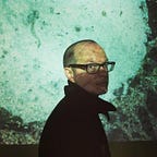
Charities are often cash-poor, with websites that reflect their limited funds — but a low-quality website can severely impact a charity’s legitimacy, driving away donors. In particular, I noted the charity’s president, Nicola Benedetti CBE (above)— a young and talented concert violinist with a significant press profile. Currently, she felt rather buried in the website, so I resolved to bring her to the forefront.
Finally, with all this in mind, I laid down some initial brand values that I felt got to the heart of what the charity stood for. These were: Collaborative, Creative, Engaging, Educational and Nurturing.
The Definition phase
With the above in mind, I decided to explore and ideate ways that we might modernise Music Therapy Charity’s website, using UX techniques to open it up to a broader audience.

While the duration of this project ruled out any extensive user research, I worked up some brand affinities to further refine how our brand would present. I chose two direct competitors, the charities Comic Relief and Cancer Research UK — and one indirect competitor, The Brit School, a famed performance art and technology school in South London with a focus on developing individual creativity. Their websites gave me a clear sense of common features — bold and striking colour schemes, plus in the case of the charities, bright and distinguished ‘donate’ buttons. With all the above still in mind, I wrote a Tone Of Voice statement that would underpin the way our website would speak and communicate.

The idea of legitimacy was still playing on my mind, however: how could I ensure the new site would feel trustworthy? To keep this notion at the centre of the design process, I decided to create a proto-persona of our idealised user, and in particular, locate some ‘pain points’ that I knew the new site needed to successfully address.

With this proto-persona in mind, I also created a problem statement:
Stephen needs clear and trustworthy information on a charity’s mission, evidence base and purpose so that he can donate confident that his money will be well spent.
The Development phase

My early mood board work hadn’t yielded a clear direction. My research around ‘creativity’-related keywords had brought up some fun, explosive colours, while the softer keywords such as ‘nurturing’ had brought up softer lilac and pink shades. I wasn’t initially sure how to reconcile these, but I was taken by the images of the sportspeople on the right, below — the shading seemed to indicate something of the players’ individual personality and creativity that I wanted to explore further.

I also refined a style guide, incorporating a minimal but colourful palette and using a single typeface, Kumbh Sans — a sans serif typeface, deemed friendly and charismatic in lower case but authoritative in upper case, so perfectly suited to a charity that wants to appear open-hearted, but also present its case with authority and legitimacy.
In the image below, you can see my prototype’s development from lo-fi to mid-fi prototype. I started with pencil and paper, first of all trying to establish a hierarchy of content.
The Music Therapy Charity’s website featured a lot of fairly low-quality photos in a mix of colours, which made it hard to establish a consistent colour scheme. I had the idea of removing the colour saturation from images and overlaying them with transparent shades, in order to bring some visual continuity. It’s not usually common to introduce colour so early in the process, but I wanted to test out how it would look before I got too far down the

While developing the two pages across three viewpoints, I made several iterations in response to feedback from my tutors and peers.
- The layout felt cramped. Using the columns and grid, I added additional horizontal and vertical space to let the content ‘breathe’ better.
- Buttons rather insipid. I used colours and shading to make buttons stand out in several smart and distinct styles, relevant to the location they appeared on the site.
- Donate button layout felt messy. I redesigned, using gestalt principles to introduce notions of proximity and similarity.

I also built a new logo, working with ideas thrown up by my mood board — see the three steps of my process above.
The Delivery phase
Below, you can see the final screens across three different viewports — mobile, tablet and desktop.


A few things to note:
Legitimacy — ‘newsy’ approach, with clear headlines and subheadings. Evidence base prominently displayed, and image of Nicola Benedetti CBE meeting the Queen adds legitimacy to the site (just above the ‘donate’ button, no less).
Colour scheme — bright and striking, with black and white imagery overlaid with transparent colours to create a sense of uniformity, even when images are of low quality
Clear hierarchy — content displayed in a clear and accessible manner, through simple, uncluttered menus and simple, straight-to-the-point language.
Key learnings
More space to breathe! I’m going to experiment further with grids and columns to ensure that layouts don’t feel cramped or boxed in.
Button clarity. For charity websites, it’s important that ‘donate’ buttons in particular stand out on the page.
Don’t feel constrained by your mood board. It’s a tool to help find your way to where you’re going — it’s alright to iterate or change course further down the line, so long as that is reflected across the design.
Next steps
Following the delivery of the above screens, this project drew to a close. However, I did have some ideas for next steps.
User testing. I’d like to test out the site on someone like our proto-persona, Stephen. Is our site clearly laid out? Does it help him understand music therapy and its benefits? Does it feel trustworthy, and — most importantly — would he donate?
Accessibility testing. While one of my ideas behind the rebrand was to reach out to a younger audience, it’s important this site still works for the charity’s existing patrons. Is this too bold a redesign for older users? The original site had an interface to increase text sizing — that could be an important addition.
Improve the donation buttons. While improved through the iteration process, this section could use a little more design work — and perhaps a call to action to encourage donation.
Thanks for reading. If you want to talk to me about this project or anything else, you can find me on LinkedIn.